ART DIRECTION
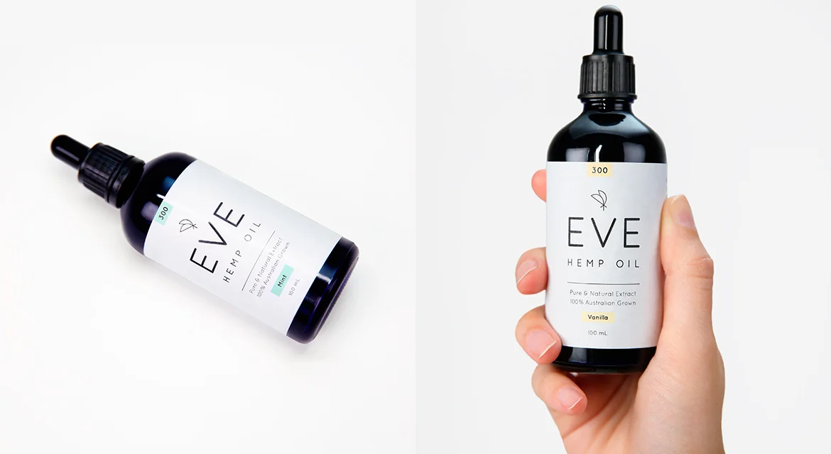
I had the pleasure of helping brand one of Australia’s first ever CBD oil products - EVE Hemp Oil. The key challenge was how to design and market a product surrounded by negative stigma, and one that is widely misunderstood. My kind of challenge.

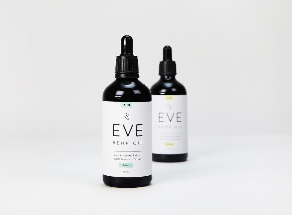
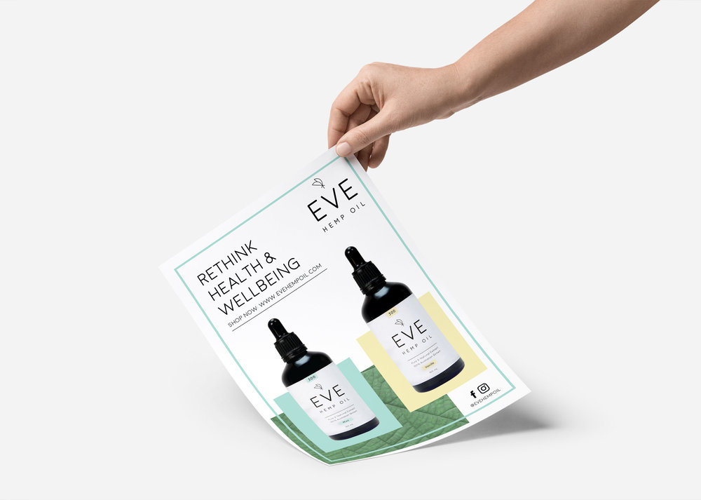
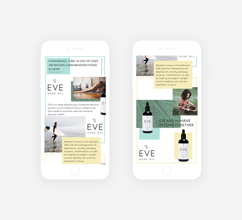
The ethos behind EVE is simple - old science becomes new science. We referenced this idea through a mix of clinical design paired with a soft and modern typeface, helping to reach our natural-product obsessed audience.
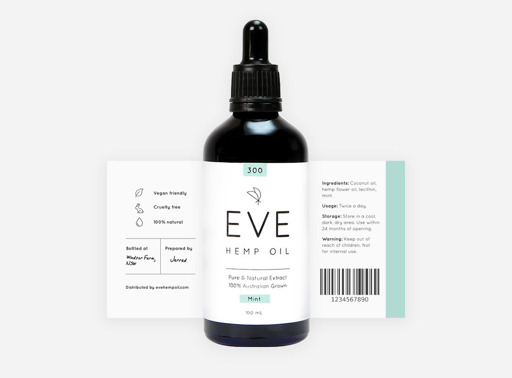
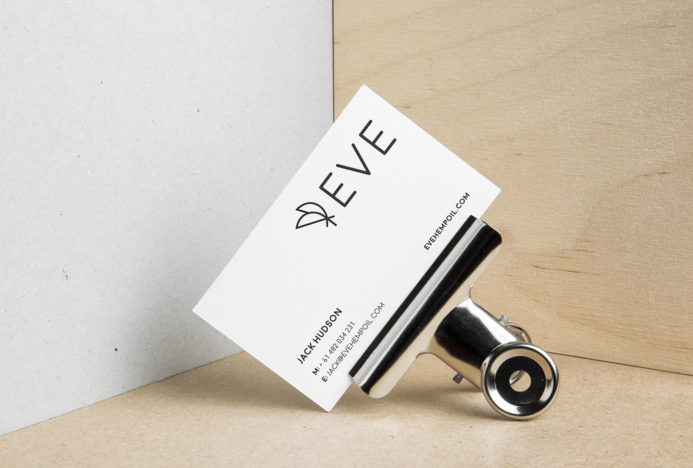
Our simple geometric logo helps communicate the brand ethos, while the minimal use of colour accentuates two varieties or flavours of EVE. We knew our colour accents needed to be fresh and playful to help bring the brand into a more modern space - something a lot of our global competitors weren’t yet doing.